How I created an identity package for Tamarind Ann Arbor Bulk Goods.

How I created an identity package for Tamarind Ann Arbor Bulk Goods.

How I created an identity package for Tamarind Ann Arbor Bulk Goods.

Weather app image
Weather app image
Weather app image

TIMELINE

February 2024 - May 2024

ROLE

UX Designer

RESPONSIBILITIES

UX Research

Sketching

UX / UI Mobile Design

Prototyping

TOOLS

Figma

Adobe CS

TIMELINE

February 2024 - May 2024

ROLE

UX Designer

RESPONSIBILITIES

UX Research

Sketching

UX / UI Mobile Design

Prototyping

TOOLS

Figma

Adobe CS

TIMELINE

February 2024 -

May 2024

ROLE

UX Designer

RESPONSIBILITIES

UX Research

Sketching

UX / UI Mobile Design

Prototyping

TOOLS

Figma

Adobe CS

Challenge

Tamarind is a small business that sells bulk goods such as nuts, seeds, grains, legumes, spices, oils, coffee, tea and candy. They were looking for a brand overhaul with a personality that is organic, natural, simple yet elegant, modern, and minimalist. They wanted an identity that conveys a sense of high-quality, natural products that are sourced sustainably. The brand needed to feel approachable and welcoming to all customers, regardless of their knowledge of bulk goods.

My Design Process

01. Research

Context Gathering - Who is the target audience?

Through communication with stakeholders, I identified the business's target audience being Ann Arbor residents and University of Michigan students seeking organic and natural dry goods. They are environmentally conscious and prefer to shop at stores promoting sustainable practices.

Competitive Analysis - Who else is out there?

I then launched a competitive analysis to understand how other, similar brands promote their products. I found many companies that promote organic products utilize earthy icons such as plants, seeds, and vines and well as a green or neutral color palate.
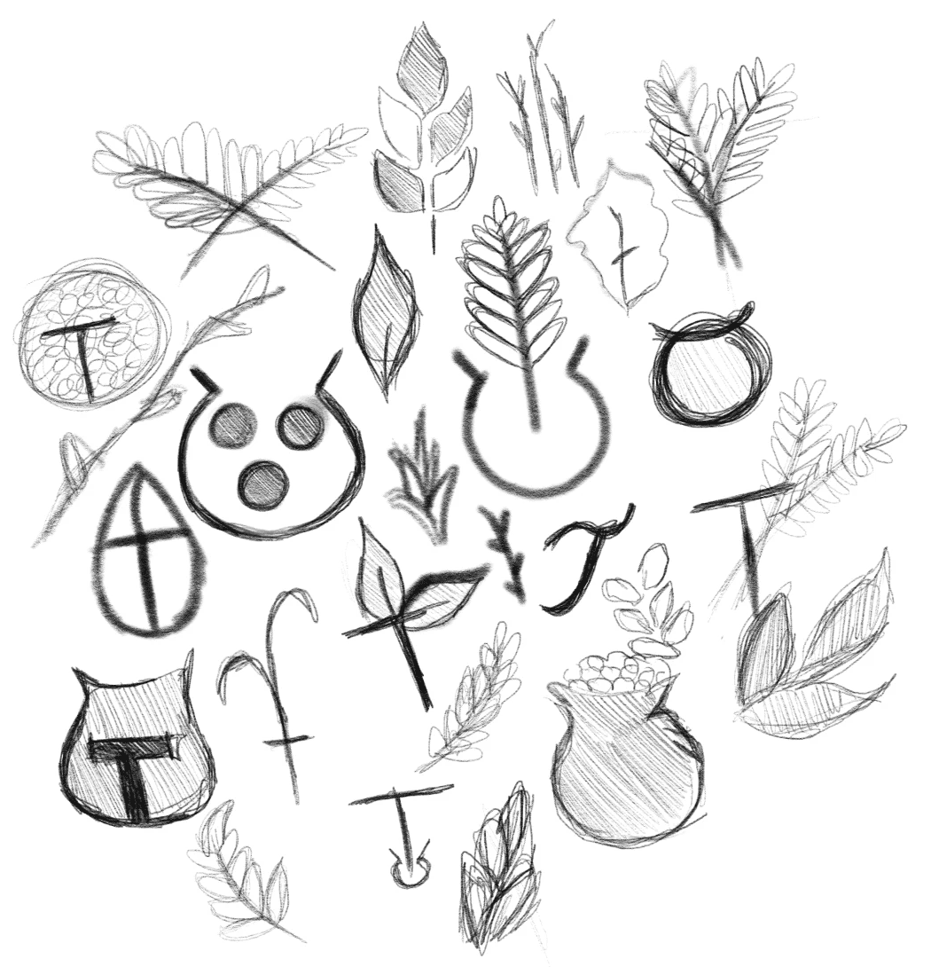
02. Ideation

Based on my research, I then started to ideate on potential logo mark images, while keeping in mind the brand's goal to stay minimalistic and elegant while promoting bulk goods.

03. Final Designs

Typography

Signature and Tagline

Joan

Joan is a contemporary sans-serif typeface designed by Nova Typefoundry. Its name, inspired by the Latin word for "grace," reflects its elegant and refined character. Joan was selected for its clean, approachable design with subtle curves that give the logo a modern yet warm feeling. This choice emphasizes the brand’s commitment to simplicity, accessibility, and timeless style, aligning with its mission to offer high-quality products.

Pairing

Garamond Premier Pro

Garamond is a classic serif typeface, named after the renowned sixteenth-century Parisian engraver Claude Garamond. Known for its calligraphic roots, Garamond combines elegance with readability, making it an ideal choice for brands that value timeless design with a touch of sophistication. Just like Joan, Garamond’s refined structure lends warmth and accessibility, aligning with Tamarind's commitment to locally sourced and welcoming products.

Color Palette

To align with the goal of conveying the natural, wholesome qualities of bulk goods, I carefully selected a color palette that incorporates earthy and neutral tones. This choice was made to evoke a sense of simplicity and sustainability, reflecting the raw, unprocessed nature of the products. The warm, grounded colors help communicate the brand’s commitment to quality, purity, and environmental responsibility, creating a visual identity that feels authentic and trustworthy to customers.

Primary Color Palatte

#D5AF30

#D5AF30

#A0812E

#A0812E

#494017

#494017

#2E9044

#2E9044

Secondary Color Palatte

#D3BD82

#D3BD82

#A0812E

#A0812E

#47422F

#47422F

#5F8E69

#5F8E69

#B1E7EF

#B1E7EF

#D8D3CA

#D8D3CA

#919ECE

#919ECE

Mark

The mark was designed to represent bulk good in a modern, simplistic way. a soft green, brown, and gold were chose to represent quality, sustainability, and commitment to organic products respectively.

The mark was designed to represent bulk good in a modern, simplistic way. a soft green, brown, and gold were chose to represent quality, sustainability, and commitment to organic products respectively.

Logotype Variants

Mark + Signature + Tagline Compact
Mark + Signature Compact
Mark + Signature + Tagline Extended
Mark + Signature Extended

Mandatory Free Space

Mark
Mark

The recommended free space for the mark, for the variation with just the mark, is 1/3 of the width of the mark

Variants
Variants

For all other variations, take one of the inner circle content from the mark, and use it as a way to define the mandatory space
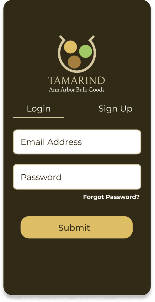
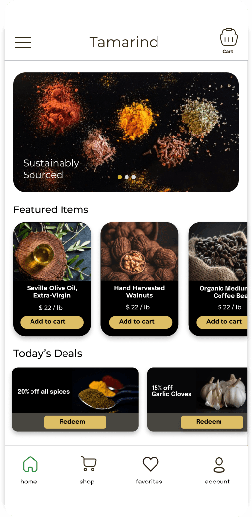
Mobile Views

Weather app image
Weather app image
Weather app image
Weather app image

Key Takeaways

Simplicity, scalability, identity

Through this project, I learned more about design and the importance of details. In my ideation phase, I realized many of my initial sketches for the logo were too intricate and complex for the image the company was trying to pursue, so I moved forward with a simple logo composed of geometric shapes. I then carried this mindset onto the typography and color palette for the brand, in order to convey their intended theme.