My Design Process
01. Research
Research Questions
How can I design an intuitive and accessible interface for older adults that effectively communicates key information in a clear and prioritized manner?
What strategies can be employed to ensure the presented data is both valuable and easy to understand, without overwhelming the user?
Secondary Research
To gain a deeper understanding of the existing body of research on optimal user interface (UI) design for older adults, I began by reviewing research papers and reports that specifically focus on interaction design for this demographic. These papers explored the unique challenges that older adults face when interacting with digital interfaces, highlighting factors such as cognitive decline, limited technological literacy, and physical impairments. Additionally, the papers provided a range of design recommendations aimed at improving usability for older users, including suggestions for simplifying navigation, prioritizing key information, and enhancing readability.

"Interactive elements such as buttons, drop downs, and links are often displayed at a small size that is difficult for older users to click on or tap" - Neilsen Norman Group
Competitor Analysis
Garmin Connect provides a robust and detailed overview of an individual’s fitness data, making it a popular choice for many fitness enthusiasts. However, for older adults, particularly those managing chronic conditions like Chronic Obstructive Pulmonary Disease (COPD), the platform can be difficult to navigate and may present more information than is necessary or helpful. The interface, with its extensive metrics and advanced features, may feel overwhelming, and it doesn't always cater to the specific needs of this demographic. Due to nesting much of the data behind buttons and displaying many metrics at once, this platform navigation can be a pain point for older adults who have not had much interaction with technology.
AARP’s platform is specifically designed with older adults in mind, offering a wide range of resources tailored to their unique needs. The site provides valuable content related to health, retirement planning, caregiving, and lifestyle, all of which are critical areas for this demographic. Its design takes into account common age-related challenges, such as visual impairments, slower cognitive processing, and reduced dexterity. For instance, AARP uses larger text, high-contrast color schemes, and clear icons to enhance readability and make navigation easier for those with limited vision or cognitive decline.
Garmin Connect

AARP

Interviews
Next, I conducted and moderated a series of six in-depth interviews with individuals aged 65 and older to gain a deeper understanding of their interactions with technology and their experiences using digital platforms. These interviews were designed to explore not only how frequently older adults engage with technology but also the specific challenges they face when using various devices, apps, or websites.
"I prefer as minimal clicks as possible, and all the information on one page"
87% of participants have had struggles with font size being too small
"I like visuals but it usually takes me a bit to understand them, I prefer simpler ones"
02. Design Requirements
Requirements
After concluding the above research methods, I then outlined the following design requirements:
03. Low Fidelity Designs
Low Fidelity Designs
Based off my design requirements, I then created a low fidelity prototype to share with stakeholders.

Note: Due to sensitive information, not all screens can be shared
04. High Fidelity Designs
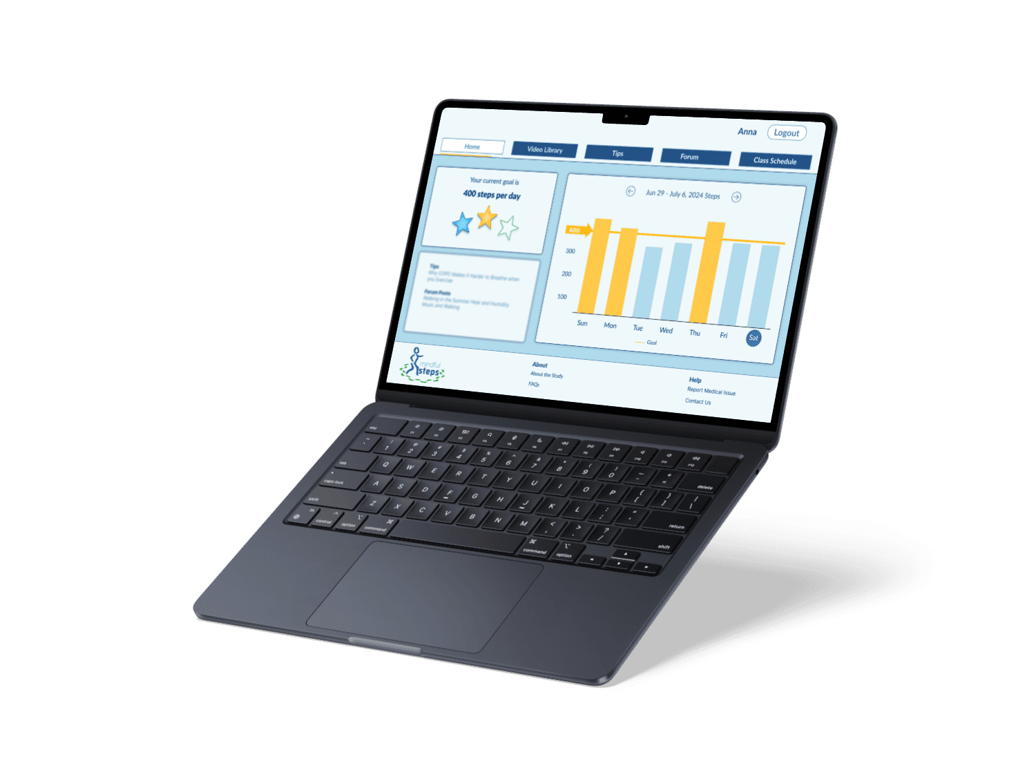
Final Designs
After several rounds of iteration, I then polished the final designs and shared with engineering to create.


Note: Due to sensitive information, not all screens can be shared
05. Reflection
Key Takeaways
Reflecting on this project, I’ve gained valuable insights into the challenges older adults face when using technology, particularly for managing chronic conditions like COPD. I learned that simplicity and accessibility are key, as many older users can feel overwhelmed by complex interfaces or too much information. Through user interviews, I focused on creating clear, intuitive layouts that prioritize ease of use and minimize cognitive load. I also realized the importance of balancing engagement with simplicity, offering features that motivate without overwhelming. This project has reinforced the importance of user-centered design and the need to tailor technology to the specific needs of older adults, ultimately empowering them to live healthier and more independent lives.